
The Rugged Route Website
Role: Web Designer
Programs used:
Project Brief
The concept and creation for this website came from Connecticut needing a mountain bike club that’s open for all types of riders. Similar clubs in the area either focused on expert, challenging terrain or didn’t have much of an online presence. Being an avid biker myself, I wanted to use my skills in web design and UI/UX thinking, to create a club that has the space to be community driven, as well as offer skill building classes and other events to its members.
The site’s message should bring locals together through the love of mountain biking by providing social events and group meetups. By creating a site that feels modern and community-centered, the club can standout as a vibrant meeting place. This site will act as the digital home base for years to come.
Creating the Site Map
Creating the site map first helped me establish the structural blueprint of the site before designing any visual layouts or wireframes. It was here that I decided what would need to be in the top navigation, what would be within those pages, and how they would all be categorized and linked to each other, for easy browsing.
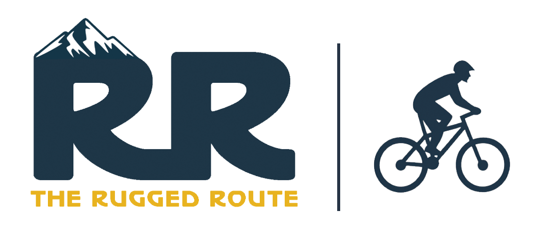
Mastering the Vibe
Once the site map was finished, I moved onto designing the logo and came up with the look and feel of the club’s image. I took inspiration from the mountains, bright outdoor imagery, and the steep scenery. From there, I expanded the colors I used in the logo to create a larger color palette. This palette would be used throughout the website and its elements. The mood board below also shows imagery that was gathered early in the research process.
Structuring Ideas Through Wireframes
Then for the wireframes, I created low-fidelity mockups of the main pages as well as the classes, trail maps, group rides, and forms page. This allowed me to envision how content would fit and how each page would be laid out, including how many images were on each page. This step was also crucial to see just how much information was needed for a sign-up form, so that its blueprint could be used for others forms within the site.
Defining High-Fidelity Wireframes
Once images and all content were collected for the site, I started creating high-fidelity wireframes in Figma. I used my initial wireframes to add images and copy to these pages. Choosing button styles and creating graphics for each page, the style of The Rugged Route came together here. It was also at this stage that I started thinking about how members would click through the site, so I added a membership button at the end of the rides page, and a calendar button at the end of the club's news page. This way one could navigate from one section of the website to another, without always having to go back to the homepage.
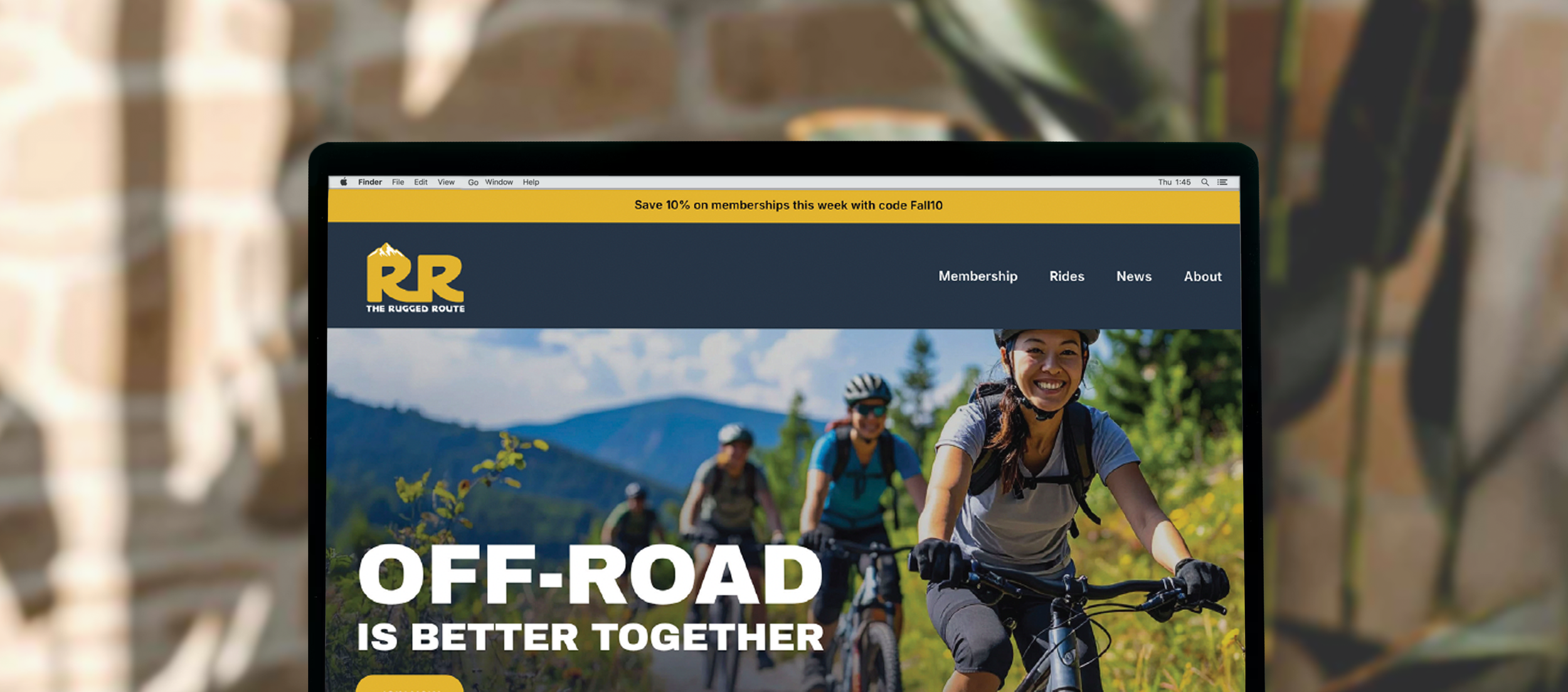
Building in Squarespace
The final step in the project was creating the site within Squarespace. I found the design process painless since I had each page mapped out with images and copy already. I was able to easily edit, play around with animation, and add effects where necessary. Below are a few of my screen shots of the actual site.
Solution & Impact
The website was designed as a community-focused platform with clear navigation that makes it easy for riders to stay up to date. By organizing content into structured sections and using strategic calls-to-actions, the site reduces friction and guides users naturally through key tasks. The visuals on the site create a cohesive and engaging experience across desktop and mobile views. As a result, the site serves as a strong hub that encourages engagement and demonstrates how thoughtful design decisions can turn a concept into a functional and successful club!