
Sobol App Analysis
Role: UX Researcher and Designer
Programs used:
Project Brief
Sobol, a health foods company specializing in acai bowls and fruit smoothies, recently gained popularity on the east coast. After launching their app to order food and track rewards, it was brought to my attention that the company was thriving as a business, but the app had less than stellar reviews. Through an in-depth analysis of their mobile app and brand experience, this case study demonstrates UX design and research skills. I focused heavily on evaluating the current ordering process, identifying user pain points, and proposing thoughtful design solutions to improve usability.

User Testing in the App
During user testing we discovered that the typical customer who visits Sobol is a health-conscious user who is looking for a quick meal or snack they can take on the go. With that, the homepage of the app needs to be inviting, and ordering needs to be quick and painless. What we found instead was an app that had too many screens and a lengthy ordering process, that turned customers away.
During testing, ordering through the app was lengthy because there were too many pages to click through. So we quickly knew the process needed to be shortened. These customers were busy and didn’t find the app any quicker than ordering in store. Many also got frustrated when substituting or adding toppings, which the app charged them extra for. These findings were unanimous between our user testing and comments made on the app store.
Creating a Persona from the Results
To evaluate the results of user testing even further, I created a detailed persona of the typical Sobol customer. By analyzing the data in this way, the design team can visualize the end user more clearly, relate to the people who use their product, and understand the reason behind the design changes. For this specific persona, Janet’s goals are highlighted, as well as her frustrations, her motivations, who she is influenced by, and what other customers would be closely related to her.
Changes for the Design Team:

Fix the glitch that is charging customers extra for swapping toppings. This should only occur if they are adding toppings to their order.

While the ingredients list was easily accessible, the nutritional information is nowhere to be found in the app. This needs to be added.

The checkout process should have less screens to click through so users can order faster, reducing drop offs. Combining some screens and features should help.
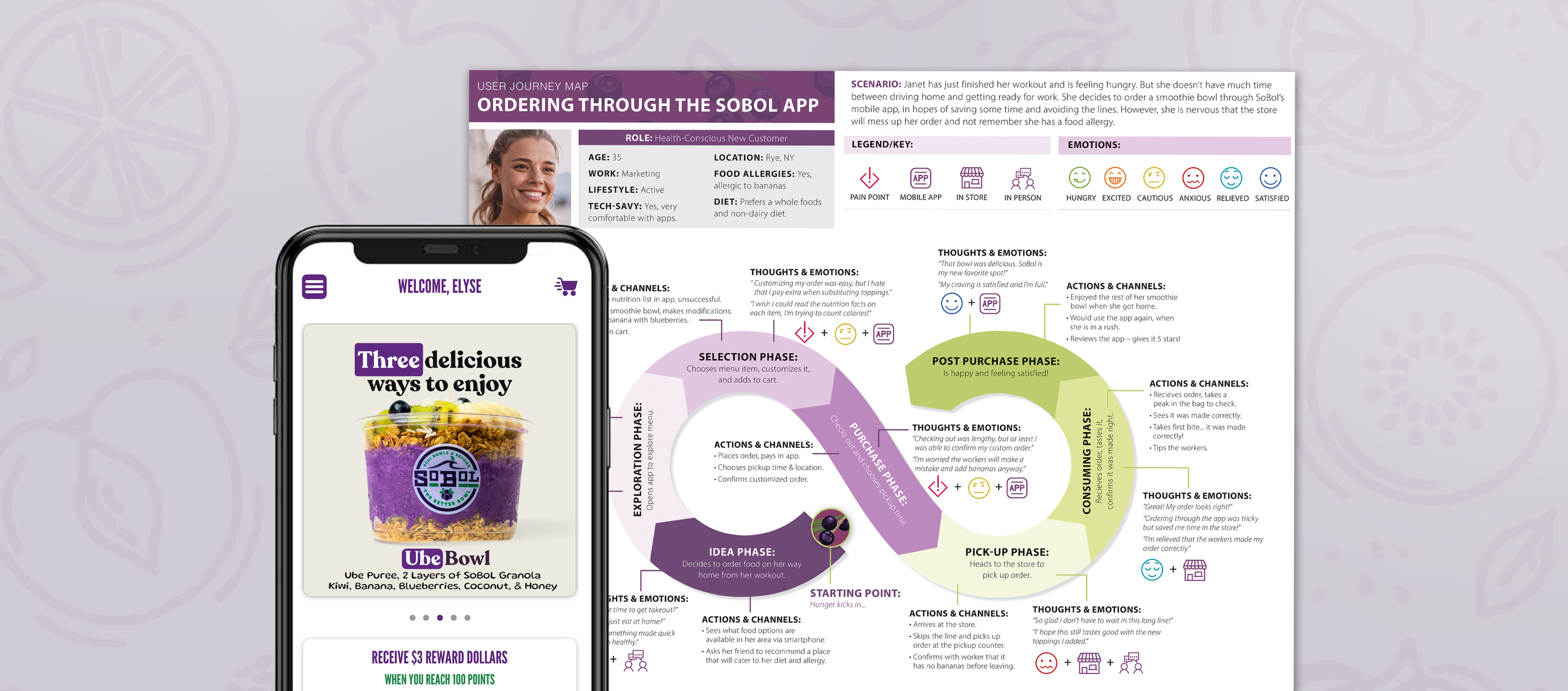
Assembling the Journey Map
After creating the persona, the journey map was the next logical step in turning data into empathetic insights. This map takes the same user, Janet, through a typical order on the app. Showing her range of emotions while going through specific, key touch points. From viewing the menu, to picking up her order, we see the struggles she runs into, as well as the positive encounters that keep her loyal to the Sobol brand. As you can see from the chart, she loved that she was able to see the list of ingredients before adding the item to cart and being able to customize her order. But her pain points came from the most common issues that were found in user testing: a lengthy checkout process and the app charged her to swap toppings.
Solution & Impact
Based on user testing insights and journey mapping, I would redesign parts of the Sobol app to streamline the ordering process and reduce friction. The primary focus would be to minimize the number of steps required to complete an order by consolidating screens. Then restructure the menu layout to make options easier to scan and adjust how add-ons and pricing are presented. There should also be a final confirmation screen where customers can view and confirm their specialized order, to help them feel more confident ordering in app.
These improvements will create a faster, more user-friendly ordering experience that better matches customer expectations. By reducing friction and increasing clarity, the changes will encourage repeat users, strengthens customer satisfaction, and support brand loyalty through its rewards system. Ultimately, the testing and final solutions demonstrate how thoughtful, user-centered design can directly enhance both the customer experience and business performance.