
Iona University Branding
Role: Graphic Designer
Programs used:

Project Overview
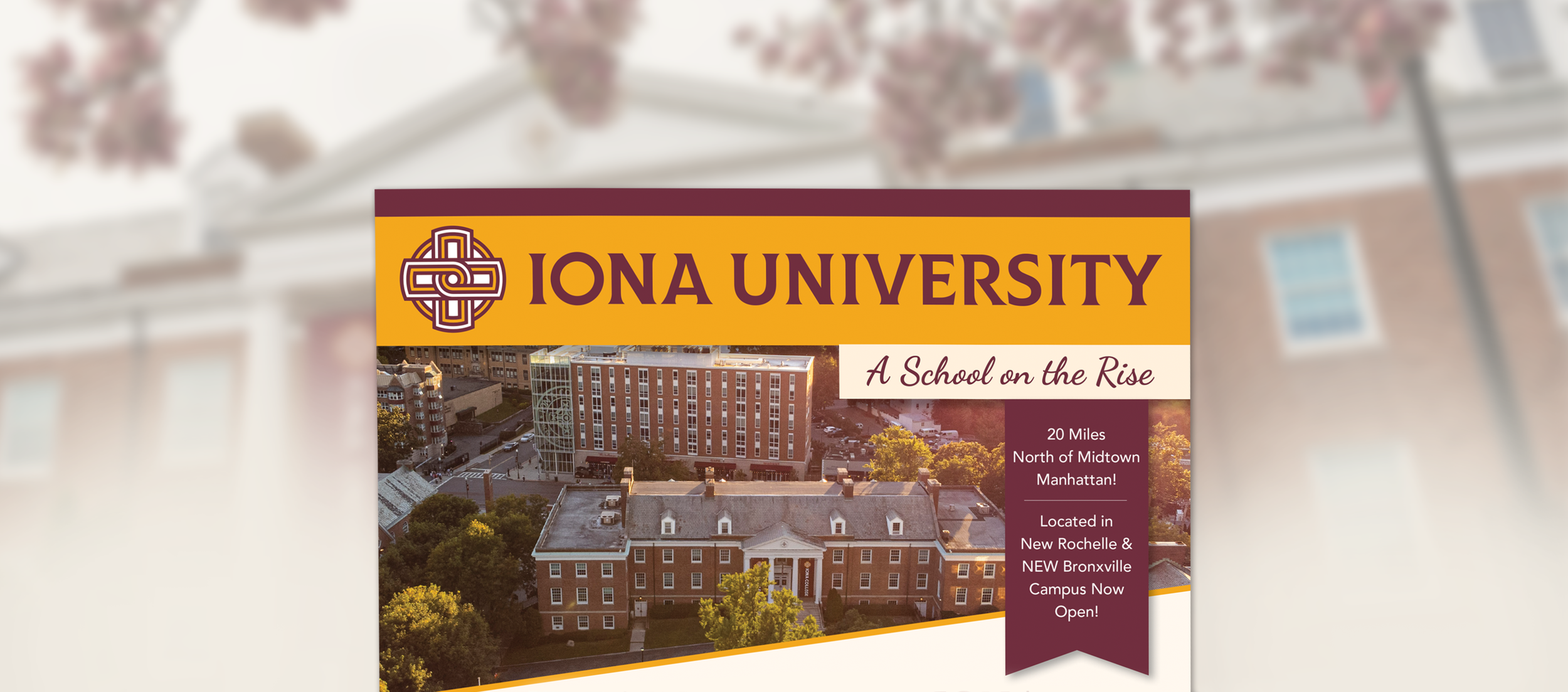
Working with Iona University, I assisted in redesigning some of their admissions event materials. I started with a full-page ad that would be featured in a college prep magazine. For this piece, I worked with a photographer to pick out photos of the campus and a copywriter to highlight what makes Iona unique. We wanted to call out their academic strengths, student life, campus community, and recent achievements—all within a single-page layout.
By using Iona’s signature maroon and gold color palette, the final design feels both elevated and energetic while staying true to the university’s brand identity. But this new layout combines a prominent campus image with key statistics that guide the viewer through the university’s strongest selling points. This is a fresh update to the original ad they had been running for years.

Expanding the Look for Event Material
Once the magazine ad was completed, I was able to expand the new branding to roll-up banners. These signs were for welcoming new students at career fairs, so showcasing student life was the theme for both versions of these signs. Keeping with Iona’s colors, logo and typography were all important, as they needed to match the printed materials that were being handed out. By keeping the final look image-focused, the signs easily became a great addition to Iona’s event material, helping them stand out and look more professional at new student events.