
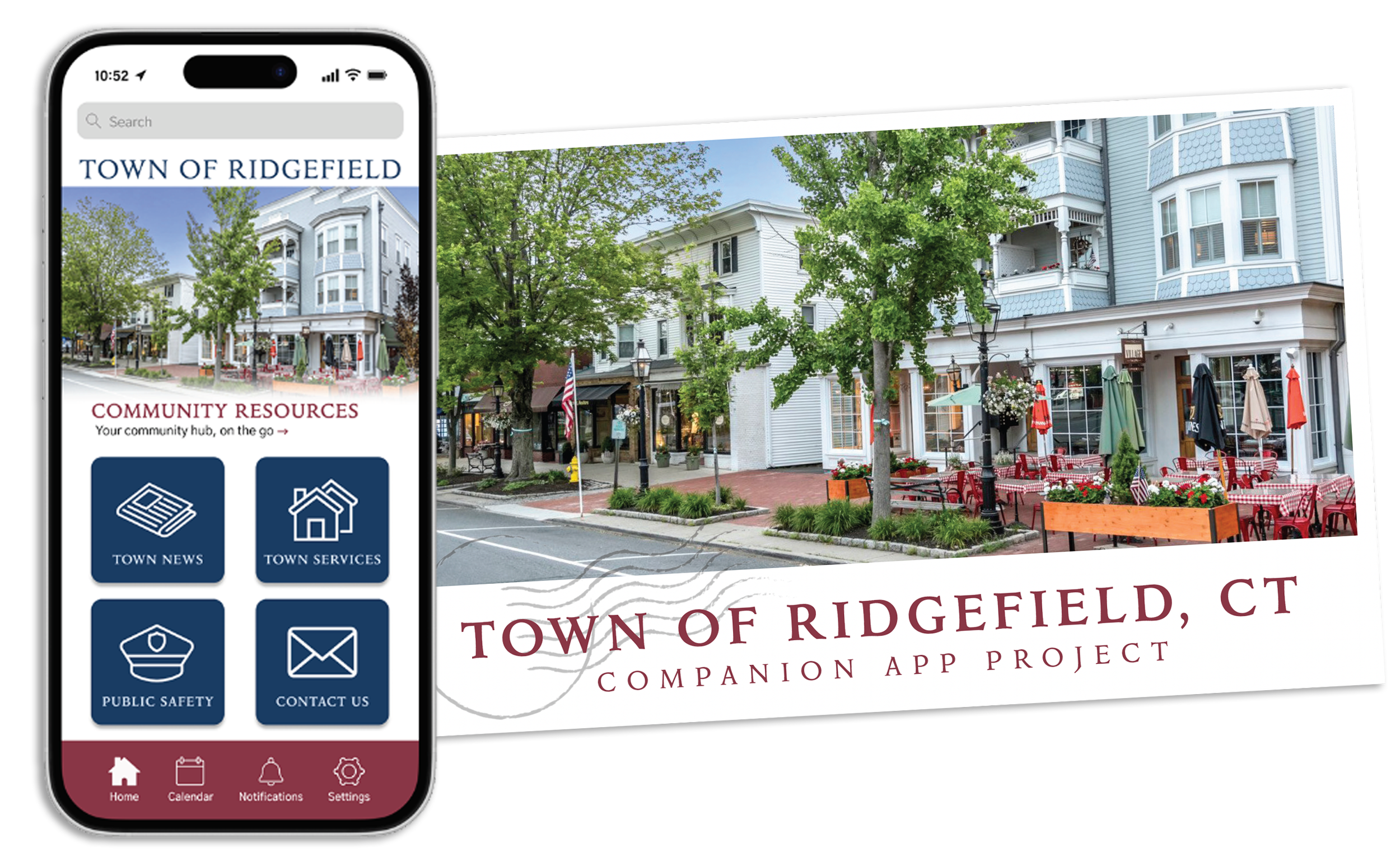
Town of Ridgefield Mobile App
Role: UX Researcher and Designer
Programs used:
Project Brief
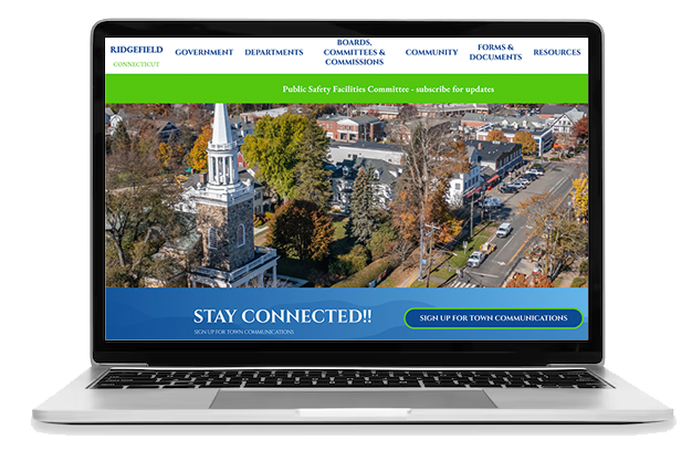
The town of Ridgefield, Connecticut has an outdated city website that quickly becomes confusing with poor information architecture and buried content. This populous town needs a better way for residents to access city documentation, put in work orders, and of course keep up with local news. To help the community, I put together a proposal of what the Town of Ridgefield could do with an app, instead of relying on an outdated website. This project showcases my full design process, from low-fidelity sketches to high-fidelity mock-ups with a narrated video walking you through my design decisions at the very end.
Mapping the Site
I started by first creating the site map for the app, while also learning about what locals visit the website for most. After doing some user research, I learned that they mostly use the website for reading about town news and ways to contact the city. Plus with the average age of Ridgefield residents being 45, it can be assumed that most own property, needing to pay taxes online and will register to vote. So, it's ideal that this new app has these sections and features from the website.
Creating User Flow Charts
After getting to know the residents, I created flow charts/ user journeys for three typical users that would be ideal candidates for the new Ridgefield app. Each with a different end goal in mind, I visually demonstrated how a user would get from one page to another, to complete their goal. It was here that I was able to see just how long it would take them and identify any friction points.
Drawing Low-Fidelity Prototypes
From the user flows I expanded on these three tasks by drawing low fidelity prototypes. They were paying a tax bill, adding an event to your calendar, and signing up for town alerts. My early prototypes were made by sketching each screen by hand and using sticky notes to emulate drop down lists within the app. Then taking these to our first round of user testing, I was able to see if my layout and functionality worked well together and if my information architecture made sense to real users. Below are a few of the sketches from each task.
Compiling User Feedback and Making a High-Fidelity Prototype
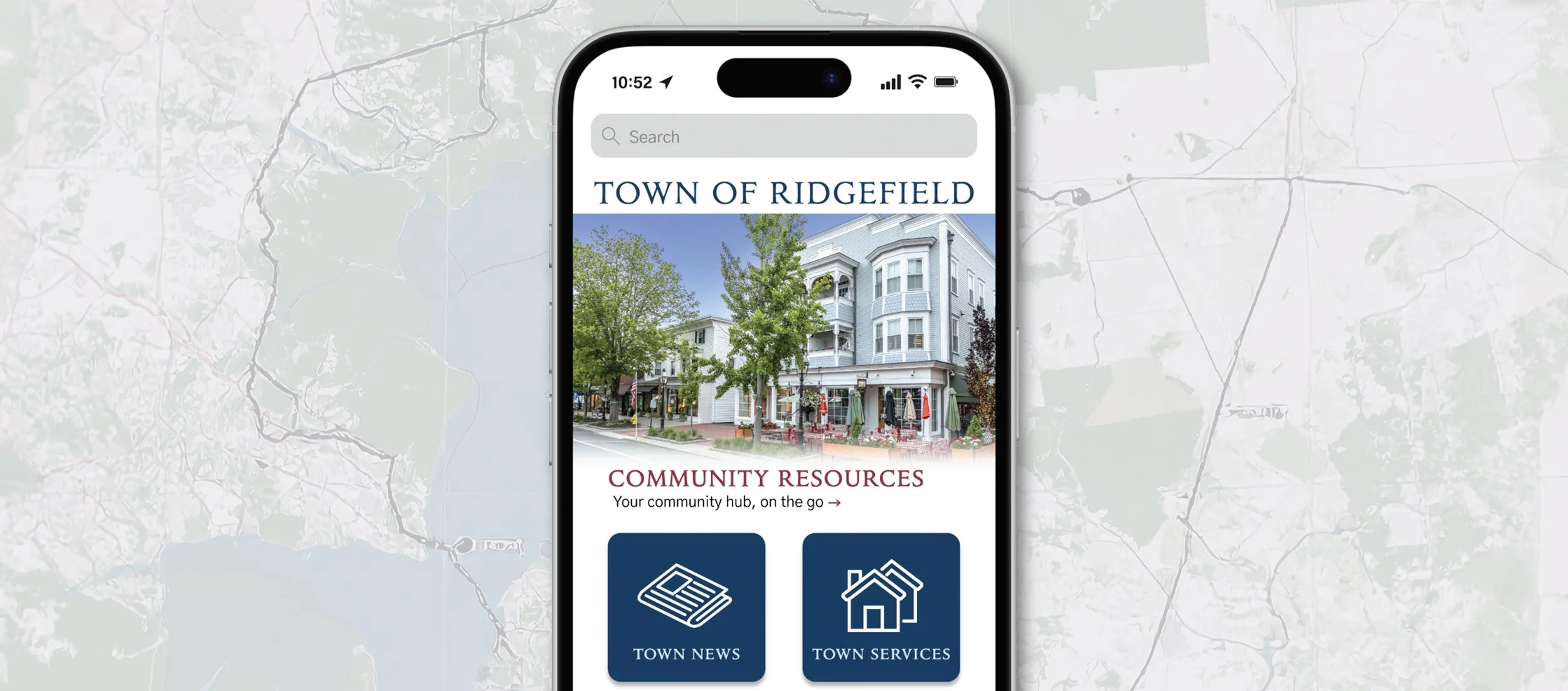
With the feedback from user testing, I created high-fidelity mock-ups in Figma, to create a working model. It was here that I got to add the details like color, images, and the overall look and feel, making the app come to life. While it looks completely different from the website, the overall design and navigation had improved drastically. I created it to where usability is easy, drop-down options are clear, and each journey is efficient. Each of the three tasks, plus additional screens are shown on the right.
Once the Figma prototype was created, round two of user testing began. This time around, I was looking to see how quickly users were making decisions, if they understood how to get to the next screen, and if they understood my icons and buttons.
User Feedback
“Getting back to the homepage was confusing and there should be an option that clearly states ‘home’ after completing a task.”
“The app feels welcoming and easy to navigate. I also love that there are multiple ‘search by’ options to pay my tax bill. The process was easy.”
“The bell icon in the bottom should include not just app notifications but include town alerts. Otherwise, the other icons are simple to identify.”
Fine Tuning the Prototype
After the final round of user testing, I updated my high-fidelity mockups with the new feedback. Icons were simplified and check out screens were adjusted. I made sure to include clearer buttons and multiple options at the end of each task. This was to ensure that there were multiple ways to complete a single user journey, helping locals find content quickly and understand where to navigate next. Below are some of the high-fidelity mockups for each task.
Solution & Impact
Just like all digital products, this entire project went thought rounds of user testing, structuring information, sketching, dissecting user flows, and then slowly added UI elements over time.
The new Town of Ridgefield app improves usability by reorganizing information into clear, accessible categories and streamlines essential tasks like paying taxes or submitting work orders. By reducing the number of steps and enhancing visual clarity through consistent layouts and navigation, the app makes it easier for residents (especially those less comfortable with technology), to complete tasks efficiently. I can proudly say this app would encourage greater engagement with town services and help the town reduce reliance on in-person support, for a more connected community.